
Problem Statement
70% of our customers are new … how is this a problem? 🤕


What?
This project is all about – 🚨 Reduce Subscription Churn – so we can keep our customers happy and subscribed for longer.
How?
To get there, we’re going to dive deep into potential problems, come up with hypotheses, prioritize potential solutions, and gather insights 🤔 through a heuristic review, moderated user testing on our target audience 👴👵 and analyze customer support feedback.
Why?
With this approach, we hope to identify the root causes of high subscription churn and ideate the best solutions to keep our customers loyal so we can avoid detractors on our subscription feature.
My role
I’ve helped within the Product team on the entire design thinking process, research, user testing (as an assistant) and revamp of the overall experience.
The team
- 1 × Product Director
- 1 × Head of UX
- 1 × UI/UX Designer (I’m here) 👋
- 3 x E-Commerce Solution Specialist
- 1 x Project Manager
- 2 × Client Stakeholders
Duration
- 6 Weeks
Type
- Co-Design
Insights & Hypotheses
Data Insight
Of the ~40% of customers cancelling subscriptions, 25% are doing it because subscriptions are hard to use.
Hypothesis
If we make subscriptions free of stress and frustrations 😫😡 we can decrease a forecast 40% subscription churn rate to 30%?
Common Customer Complains

Key Demographics
50% of women past 65 is incontinent, and about 25% of men.
UX Insight
With time and money invested, customers are severely aware of any friction while managing orders and self-service features.
Frustration and ‘loss aversion’ can quickly mount if tasks are difficult to accomplish.
Source: Baymard Institute
Understanding & building empathy

Why?
After the first launch, only 30% of customers were using the feature. But this allowed us to collect feedback and then group it to give us a better understanding of which direction should we take to improve the customer experience.
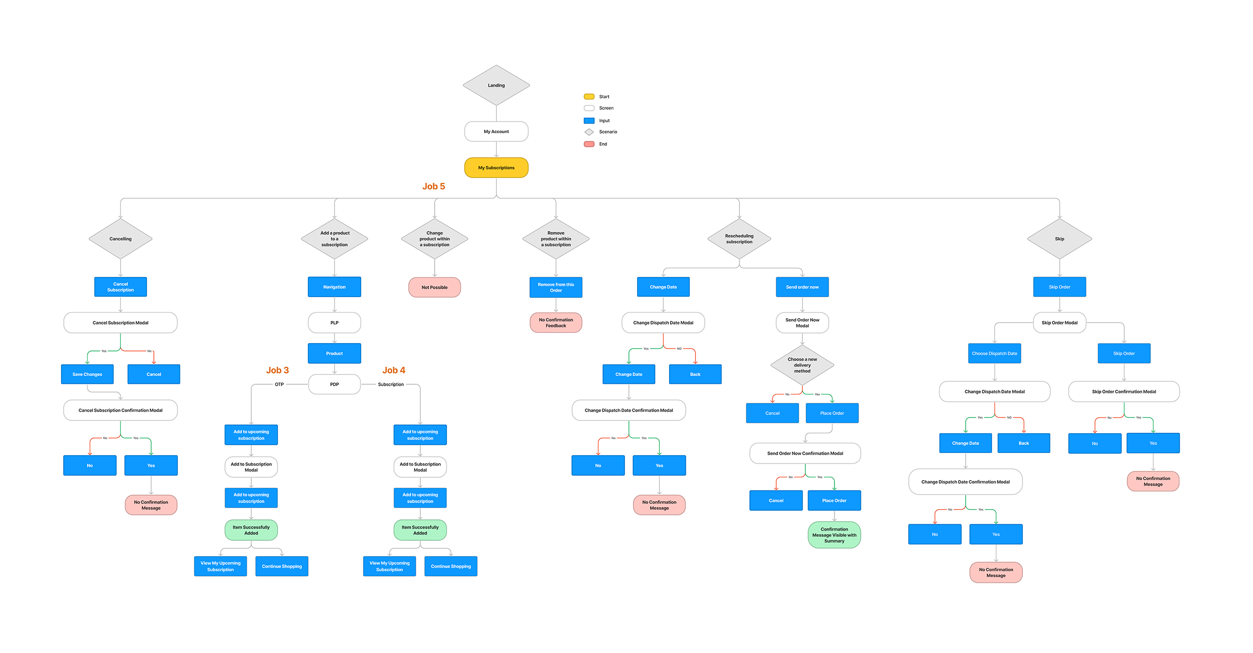
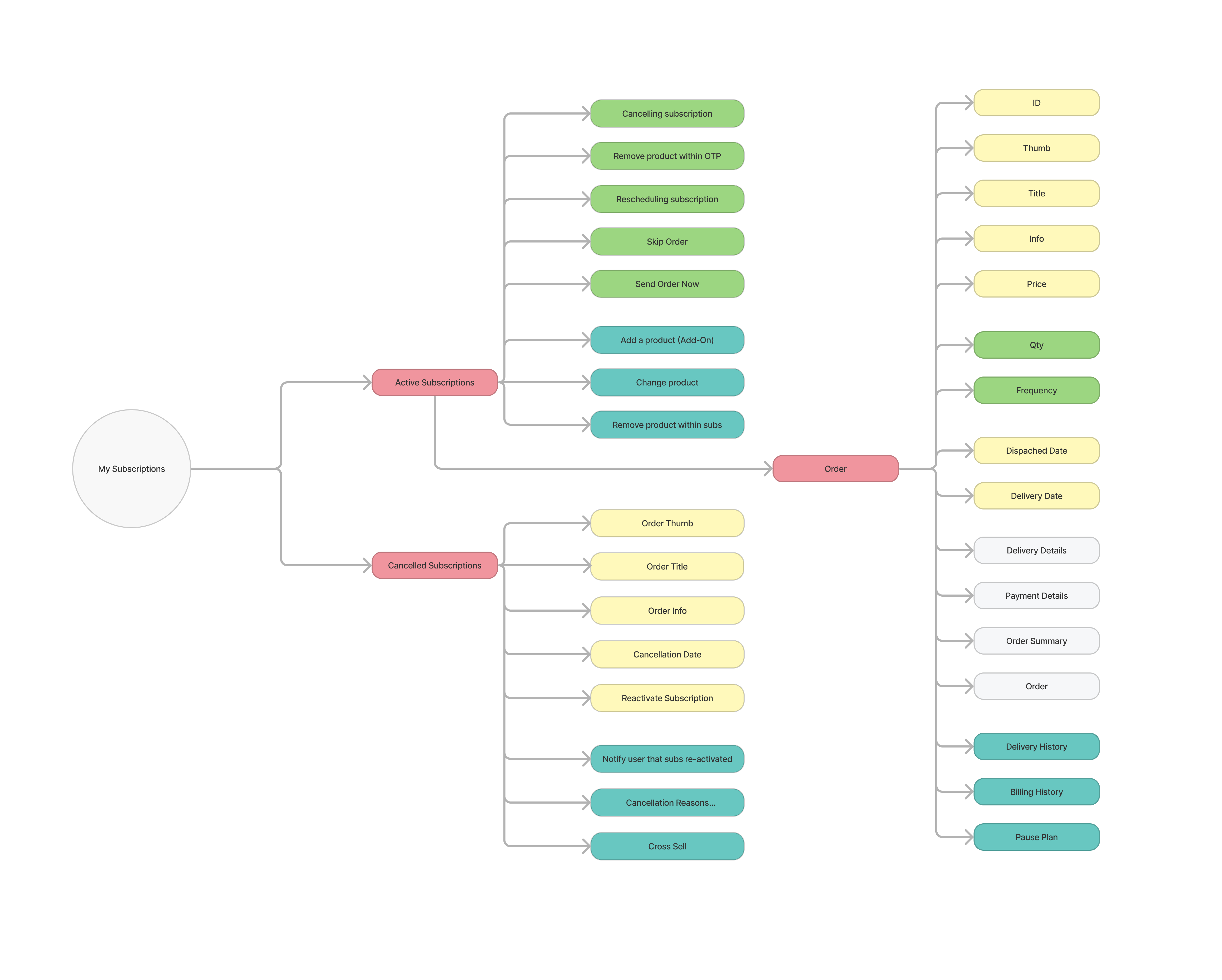
Scenarios Found
- I want to Manage my subscriptions
- I want to Cancel a subscription
- I want to Add a OTP product to a subscription
- I want to Add a subscription product to a subscription
- I want to Change product within a subscription
- I want to Remove product within a subscription
- I want to Rescheduling a subscription
- I want to Skip an Order
Goals
Identify 🤗 user needs for better information hierarchy. What do users care about on a subscription plan?
Reduce 😡 cognitive load by deprioritizing irrelevant information.
Improve compatibility with real world language by revealing terminology issues, for example: Subscriptions vs Order 😫 ? …
Through 🛍️ competitor research gain a deeper understanding of the target user group and their needs, preferences, as well identify trends, patterns, and opportunities in the market.
UX Insight
UX Jackob’s Law – Users spend most of their time on other sites. This means that users prefer your site to work the same was as all the other sites they already know.


Findings
We found major UX heuristics, making the product’s clarity and discoverability complex:
- Heuristic: User Control and Freedom
- Heuristic: Visibility of system status
- Heuristic: Locational Information
- Heuristic: Terminology and Language Style
- Heuristic: System Defaults
As per the data, users will face accessibility issues and a substantial 😡 cognitive load while using the site.
Also on our research we notice that some competitors have a dedicated page that helps the onboarding and awareness 🤑 of ‘Subscribe & Save’.
Why a Heuristic Review?
‘60% of consumers abandon purchases due to poor user experience, costing e-commerce companies billions.’
A heuristic review is performed on a website to identify potential usability issues and to make recommendations for improving the user experience.
Scoping what to solve first
HMW
Present the account area so it’s easier to scan it?
HMW
Allow users to add a product to a subscription (not OTP)?
HMW
Allow users to add a OTP to a subscription?
HMW
Allow users to change product within subscription?
HMW
Avoid users missing how to cancel?
HMW
Allow users to take one product out of subscription?

UX Insight
“How might we” questions are a valuable tool for UX designers because they encourage creativity, empathy, and a user-centered approach to problem-solving.
They help designers to generate new ideas, stay focused on user needs, and ultimately create more effective and satisfying user experiences and are a common technique used in UX to generate ideas and solutions to design challenges.
Ideating
2x 🤔 Strategy Workshops
We called them ‘Stories, Hypotheses & Problems Workshop’ as they’re essentially ‘strategy stuff’ with the purpose of identifying a ‘problem space’ that is worth solving. We would like for this to be intro to clients as relevant / possible.
1x 🤝 Co-Design Workhop
The purpose of this ideation meeting was to generate ideas together with stakeholders based on the research we collected and from them on create a scope of future work. We invited the PM, 3x E-Commerce Solutions Specialist, a Head of UX together with 3x Client Stakeholders. To be able to manage everyone’s time we adapted the 5-day Design Sprint format to a 1-day split into 2 periods of 2.30hrs. The session was facilitated by our Product Director.
Our aim was to co-create and get everyone’s input from all the different specialty angles in order to create a prototype that would cover discoverability and the improvements needed based on the research so far.
The workshop agenda included:
- What is co-design?
- Research playback
- Inspiration wall
- HMWs
- Concept sketching
- Prioritising Key Decisions
Why Co-Design?
Co-design workshops are important to align stakeholders because they promote collaboration, shared understanding, empathy, ownership, and efficiency in the design process.
By involving stakeholders in the design process, designers can create more effective and user-centered products or services.
Source: ChatGPT
What’s 🚨 priority vs what can be done later
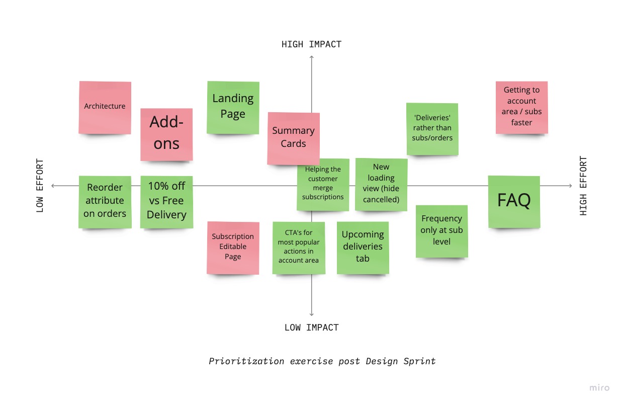
After a very productive Sprint we had a good number of ideas and business requirements, but we had to narrow it down once again (diverging & converging), so the entire team agreed where each solution would fall on an Impact VS Effort matrix. We decided to focus on:
- Subscriptions frequency only at sub level
- Not editable sumaries
- Add-ons
- Reorder attribute on orders
- ‘Deliveries’ rather than subs/orders
- Personalise Homepage
- Getting to account area / subs faster
- 10% Off vs Free Delivery
- Helping the customer merge subscriptions
- New loading view (hide cancelled)
Impact VS Effort Matrix
Explore & Play
Here we’re aiming to gather feedback and iterate on the design ideas before moving into higher-fidelity prototypes.
By creating wireframes and sketches, we’re empathising with the needs and pain points of our customers while trying to identify areas of the UI and flow that may be confusing 🥵 or difficult to use, and then make adjustments accordingly 🤗 and prepare a mid-fi prototype for user testing.


Refining User Flows
We’re all about making the user journey smooth and easy 🤗, cutting out any unnecessary hurdles and making sure users can achieve their goals with ease.
We’ll keep tweaking and improving to make the experience seamless and enjoyable. It’s been a team effort, with everyone’s input and insights coming together to align and converge towards our 🎯 goal.
UI Design
Some 🙃 iterations later…
Once we finalized the two journeys 🤗 for deliveries and subscriptions flows, along with a cross-sell section plus FAQ, I proceeded to design the mockups in Figma. Our plan was to conduct remote prototype testing with a select group of our customers.

Despite some initial 😛 bumps in the road during the Explore & Play design process, we made sure the final mockups rocked with 😎 user-centric solutions (Laws of UX) that create an intuitive and visually awesome interface, boosting the overall user experience. Now it’s ready for some kick-ass user testing!
Takeaways
So, 🤔 what did we learn?
-
Understanding the reasons behind user churn, we targeted acessibility and user psychology to tailor the unique needs of this demographics, ultimately 🤞 enhancing the usability and overall user experience of this subscription product.
-
Project is still in progress, and other features are in the roadmap backlog to be implemented with our remaining designer and PMs making continuous tweaks as our team navigates downsizing and the changes brought on by revenue loss on other client projects and the overall economy.
-
Next steps would involve iterating on the second round of user testing, taking into consideration any tech constraints, and refining the high-fidelity prototype to make it 👌 production-ready.