The team
- 1 × product owner
- 1 × ux manager
- 2 × product designers (I’m here)
- 1 × engineers
- 1 × QA
Duration
- 2 Weeks
Type
- In-house
The main goal of the project is to ensure an optimal deposit process – Drop of our looseness score – Through a series of iterations, increase new player satisfaction by making “deposit & bonus” page easy, accessible and enticing – Through a re-design of the cashier screens, we hope to increase the number of deposits by significant %.
I’ve helped within the UX team on the entire process, research, user testing (as an assistant) and revamp of the overall experience of the new cashier.
Let’s define the problem, Ok?
The business found out that users on our existing cashier and the bonus screen seemed to be a considerable blocker with most users failing to complete the deposit process due to a confusion of this screen.
Research
What your competitors and other designers are doing, take a look.
I wanted to observe what were the UX trends in the sector and examine the information architecture of these sites, how they show their services, payment methods, etc. This is critical because users/players do use several brands and usually are not committed to one.


Conclusions
We found different styles and UI patterns along our research, even in the gambling industry. There’s no clear standard but we took into consideration really great examples.
”After a thorough heuristic review of the cashier section on our sites, we found that it had few measure flaws, usability issues and difficulty in understanding of this screen.
A qualitative research feedback confirmed the first assumptions.UX Team

After that, we managed to map a simple journey user flow, positive vibes!
As is known, a UX / UI Designer needs at least a simple user flow as a reference to start developing a project and at the same time to understand the possible movements of the user. It served as a map to navigate in the development and user understanding of this app. In this case this was pretty much locked, the UX team couldn’t change the journey or interactions.

Finally after the research phase, the product team and stakeholders agreed on moving forward with the revamp of the Cashier. We’re on the right track.
Ideation
As a group participating in Design Studio we sketched, pitched and critiqued ideas to rapidly generate further refined solutions.

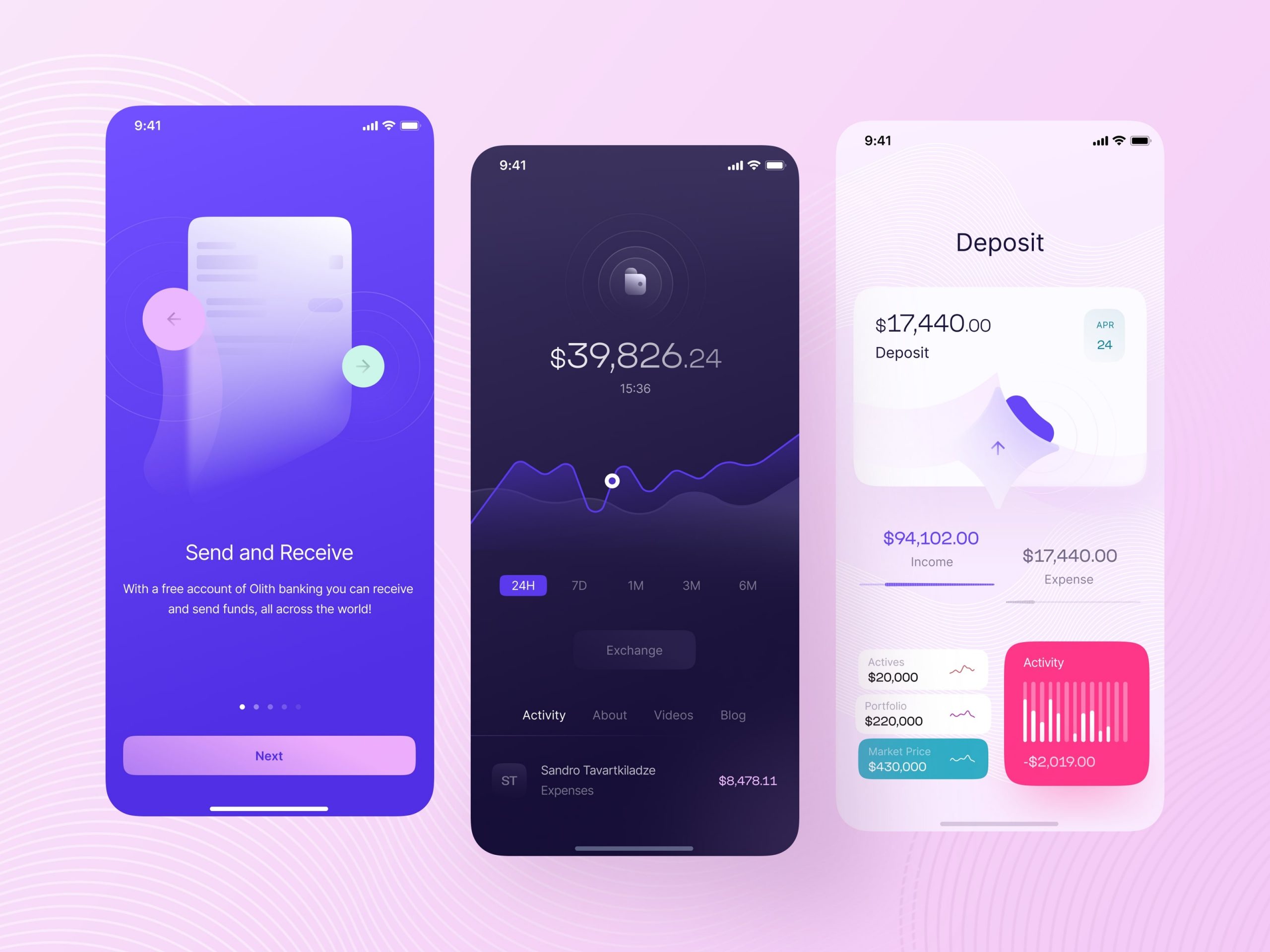
UI High Fidelity
We proceed by making HiFI-UI screens in order to be able to present it to the main stakeholders. Being the cashier one of the most important pages on our sites, we wanted them to see our findings clearly.
